Reducing real-world confusion in a healthcare app by making system intent unmistakable.
Role: UX/UI DesignerPlatform: Mobile AppFocus: Clarity, Accessibility, Design Systems
Context
In CSL Plasma's donor app, used by more than 1M active donors, this feature lets donors set a reminder for their next visit.
At first glance, the flow seemed straightforward, but in practice, users were misunderstanding its core purpose. Instead of setting reminders, some believed they had booked actual appointments.
In a healthcare setting, that confusion doesn’t stay in the interface, it shows up in real life.
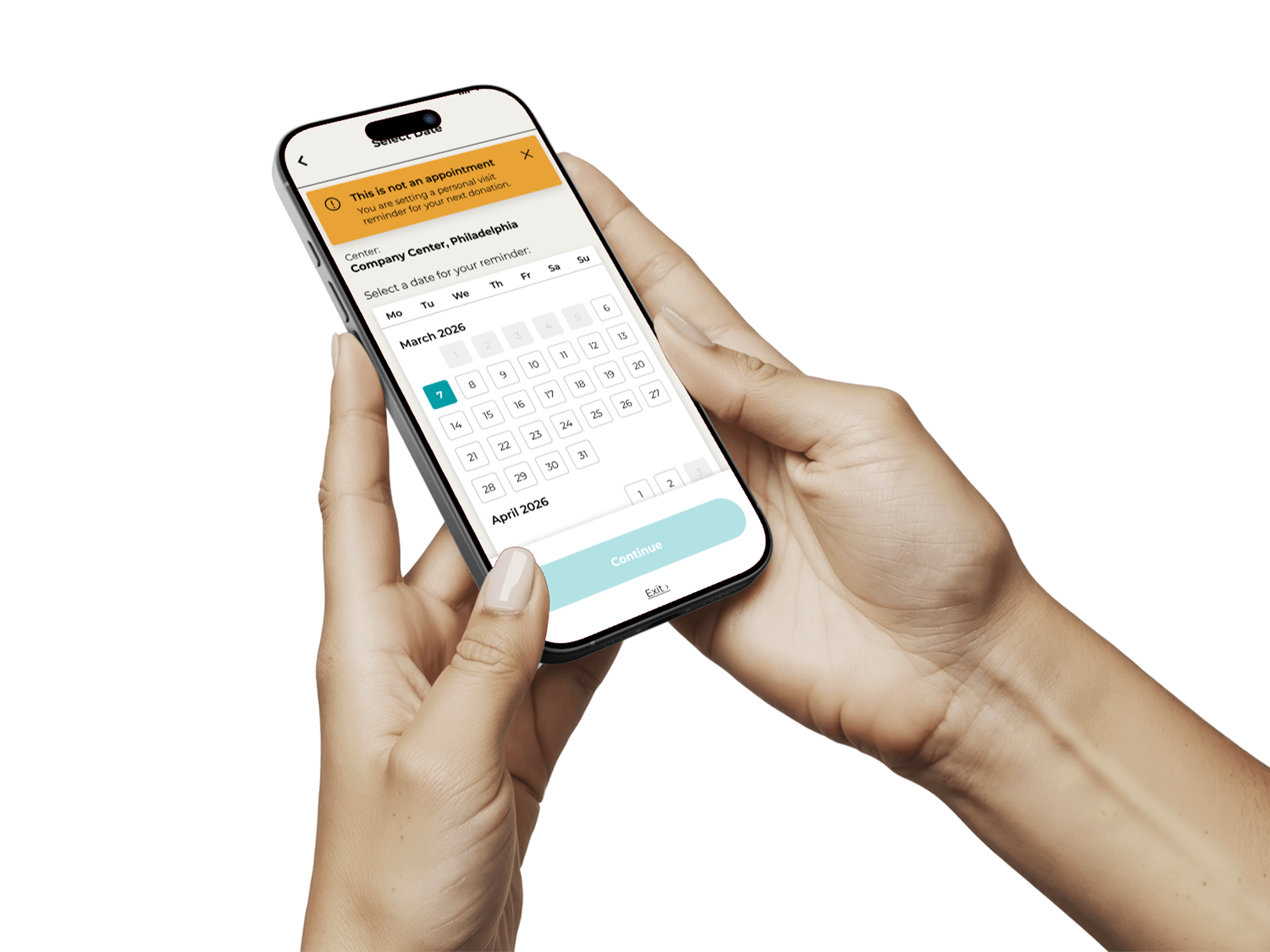
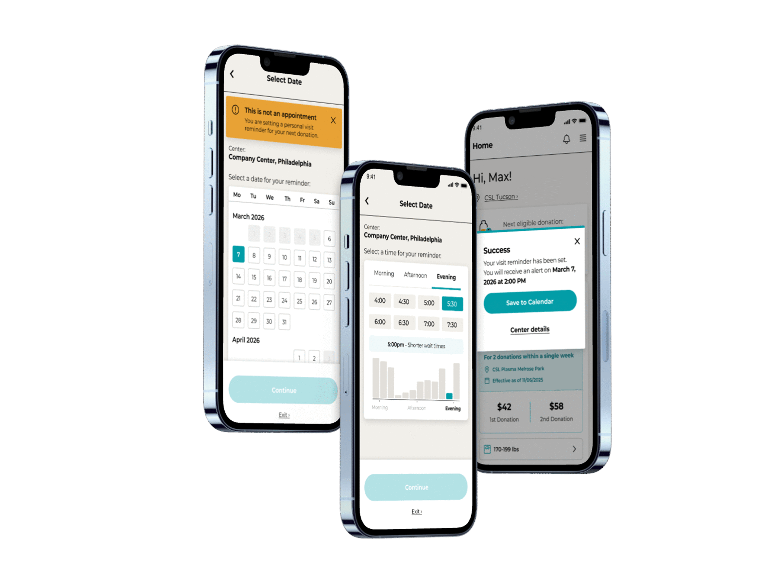
Updated reminder flow
Problem
Users were arriving at centers expecting appointments that didn’t exist.
The interface did not clearly communicate intent. The most critical message, “this is not an appointment,” was easy to miss, which gave room for users to complete the flow with the wrong understanding.
This created friction for both users and center staff, turning a simple feature into a source of operational confusion.
Why This Matters
This wasn’t just a UI issue, it was a trust and expectation problem.
Users lose confidence in the app.
Staff must manage avoidable frustration.
The product creates real-world inefficiencies.
Clarity here wasn’t a nice-to-have. It was essential.
Design Approach
The focus here was making intent clear before users could misinterpret the flow, while improving accessibility and aligning with our updated pattern library.
Goal
Make it clearer that users are setting a reminder, not booking an appointment.
Improve accessibility and visual clarity.
Align the flow with the updated pattern library.
Key Issues Identified

This issue surfaced through feedback. We reviewed the existing flow and identified two failure points: the critical disclaimer was buried below the fold, and the busy indicator relied on color alone.
1) Critical messaging was easy to miss
The disclaimer “This is not an appointment” was placed at the bottom of the screen.
Users could move through the flow without ever seeing it, making the most important information feel secondary.
2) Accessibility gaps in time selection
Busy indicators relied heavily on red, yellow, and green color states alongside an icon.
This created challenges for users with color vision deficiencies and made an already important decision harder to interpret.
Earlier version of the flow.
Improvements
1) Front-loaded clarity
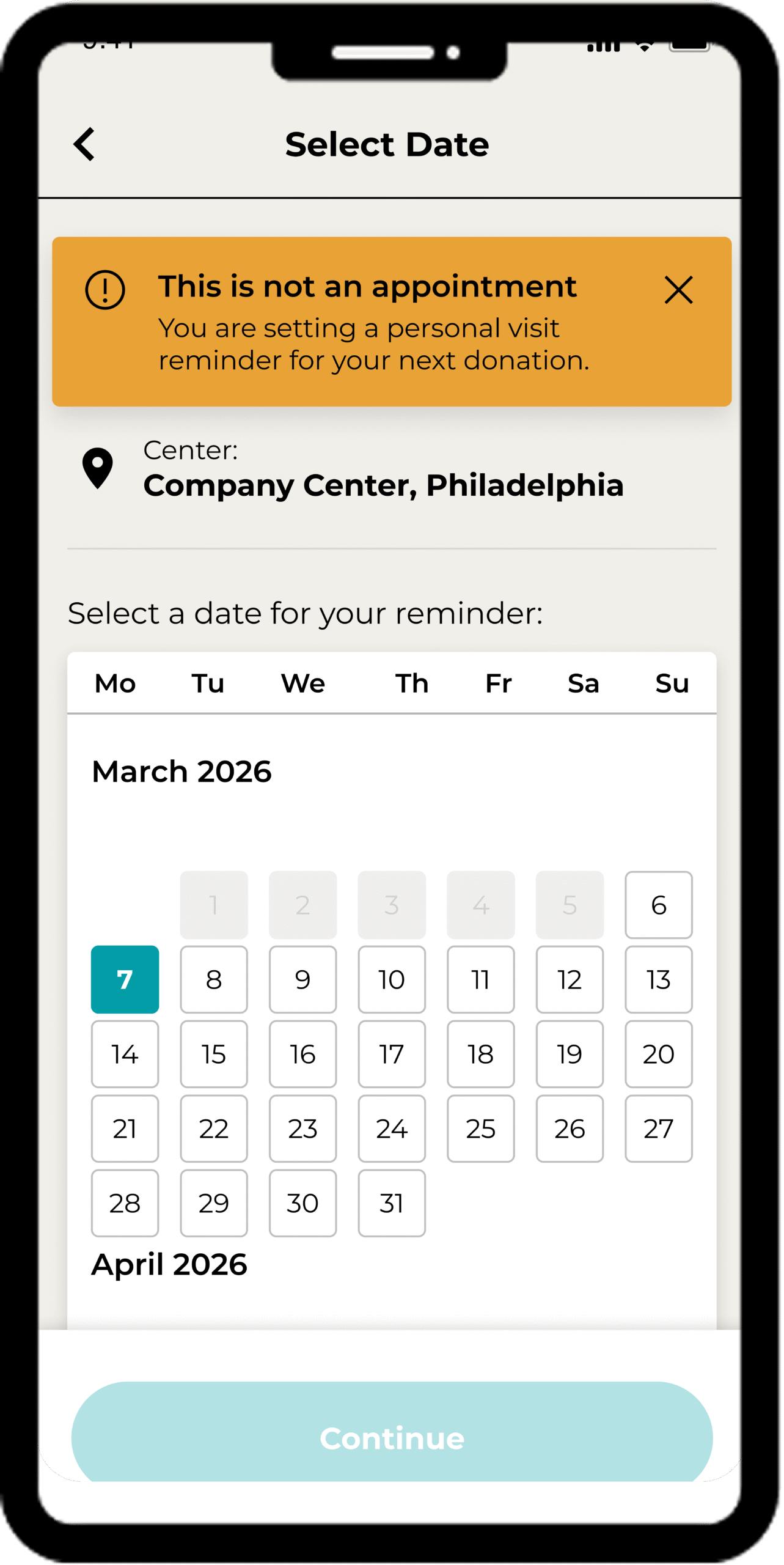
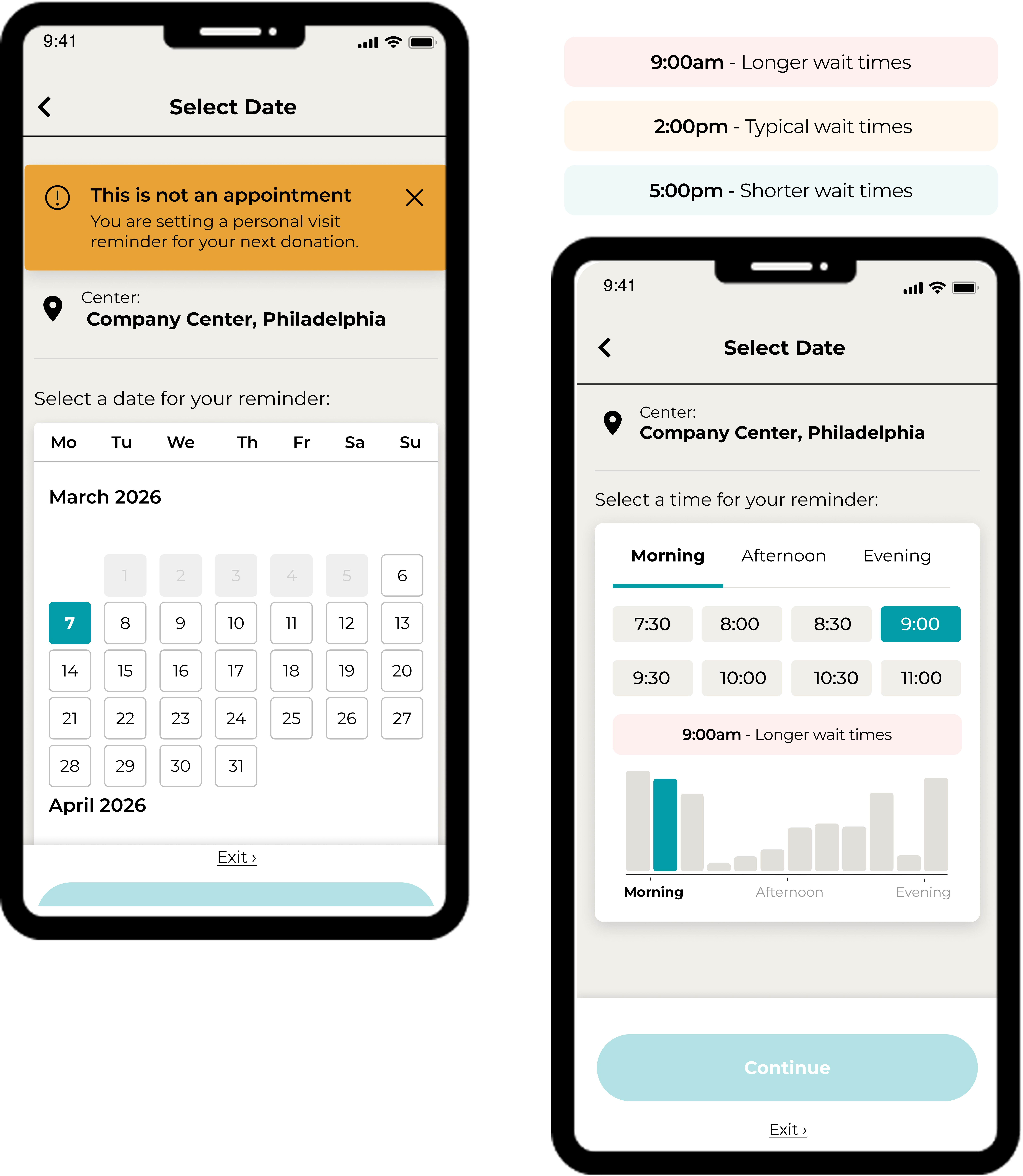
Introduced a dismissible banner at the top of the screen to clearly communicate that users are setting a reminder, not booking an appointment.
This ensures the message is seen early, before users commit to the flow.
2) Accessible data visualization
Replaced the color-only busy indicator with a bar chart.
This allows users to interpret busyness through both height and color, reducing reliance on color perception and improving scannability.
Reworked reminder flow with clearer messaging and more accessible visual cues.
Expected impact
Fewer donors arriving for appointments that don't exist, because "this is not an appointment" is now the first thing they see.
Busy times that can be read without relying on color, for donors with color vision deficiencies.
Fewer avoidable conversations for center staff about bookings that were never made.
A flow that matches the updated pattern library, so it looks and behaves like the rest of the app.
How we'd measure it: how often donors arrive at centers expecting a booking, and whether people can tell, in a quick comprehension test, that they've set a reminder rather than an appointment.
Additional final-state supporting mockup.
What This Shows
Small design decisions can have real-world consequences.
By making intent explicit and designing for accessibility, this work improved not just the interface, but how users understand and rely on the product.
This case study has been adapted and sanitized to remove proprietary details while preserving the design approach and outcomes.