Transforming a Fragmented WordPress Site into a Playful, High-Converting Customer Experience
Project: Gamezone Ghana website redesign and development My role: UX/UI designer, information architect and WordPress developer Tool box: WordPress, WooCommerce, custom code and Elementor Scope: Content audit, UX strategy, visual direction, responsive design, frontend development, commerce integration, content migration, accessibility, debugging and launch refinement
Project Context
Gamezone Ghana operates two connected businesses. It sells board and card games, and it provides games and coordinated experiences for parties, corporate events, schools and gender reveals and more.
The original website had years of useful products, event pages, images and operational information, but it didn't have a clear system. The shop, rental offering and supporting pages all felt like separate websites and was a little overwhelming.
To improve this, I had to understand what already existed and what needed to change. I reorganized the experience, simplified how customers move between shopping and events, and refreshed the design while keeping Gamezone’s existing store and payment systems intact
The finished work is a custom WordPress theme spanning the complete customer journey: discovery, shopping, product details, cart, checkout, wholesale, event exploration, booking information, terms, contact, social proof and ongoing content management.
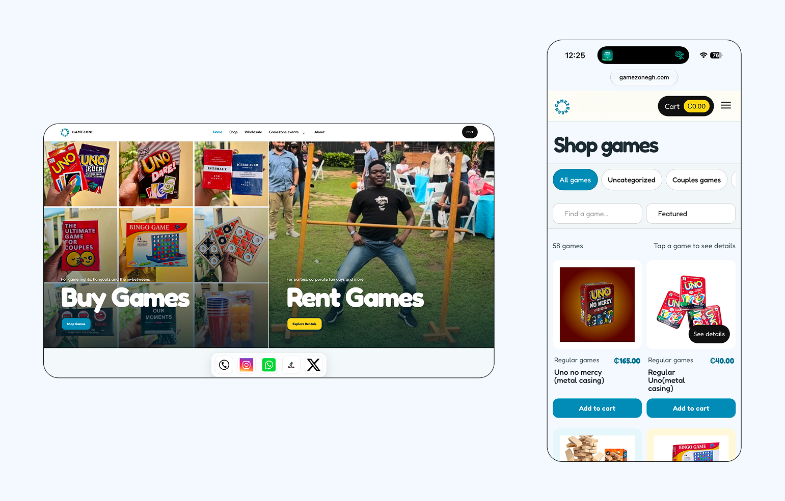
Revisiting Gamezone
I built Gamezone’s original website a year earlier, when the business and its needs were much simpler. Coming back to redesign it gave me the opportunity to see how the business had evolved since then and the website had to reflect that.Hence, this project began with a live site rather than a blank canvas. That changed the nature of the work.
I had to account for:
- A large e-commerce catalogue with live products, prices, stock and images
- Existing website pages created at different points in the business
- Separate shopping, wholesale, rental and event journeys
The redesign therefore became part UX project, part content migration, part design-system build and part live-platform debugging.
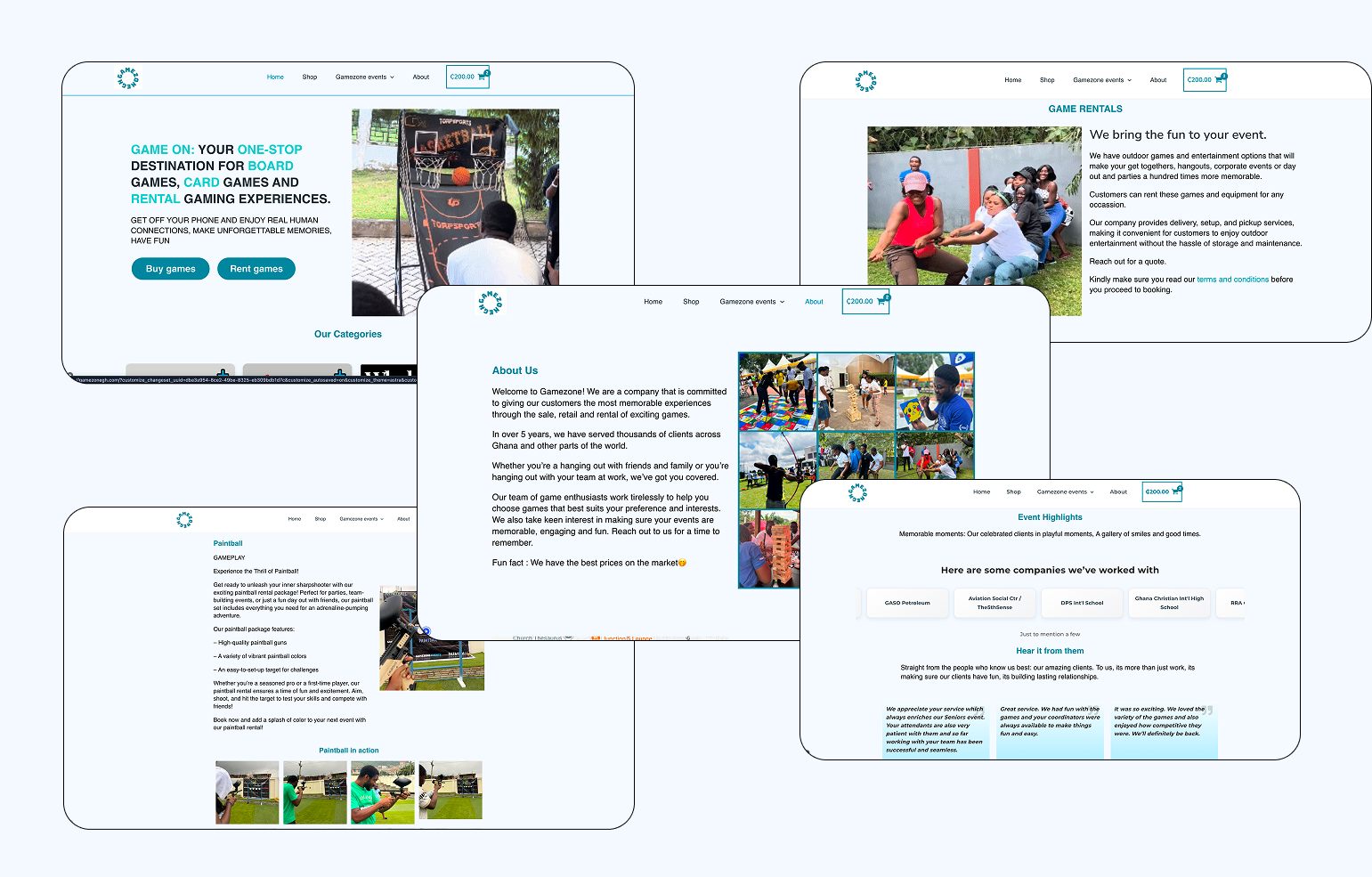
The central design problem
Gamezone serves people with very different intentions: someone buying one game, a retailer looking for wholesale quantities, a parent planning a birthday party, a company arranging a team-building event, or a customer comparing rental packages and delivery terms.
The site needed to serve all of them without becoming a directory of unrelated pages. I framed the work around one question:
How can Gamezone keep it's brand identity while allowing customers with different goals quickly enter the journey that matches what they came to do?
That question shaped the information architecture, homepage, navigation and visual system.
My goals
- Make buying games and booking experiences immediately accessible.
- Give Gamezone a digital identity as lively and social as the business itself.
- Make a large catalogue comfortable to browse on mobile and desktop.
- Keep the existing e-commerce setup responsible for the critical commerce logic beneath the new custom interface.
- Consolidate scattered information into clearer, purposeful pages.
- Give Gamezone a system it could operate without needing a developer for every content change.
Deeper process Audit, information architecture, storefront, checkout, events, accessibility, and technical architecture.
The process
1. Auditing the live site before designing the new one
I began by tracing the site as a customer and as an administrator. I reviewed the navigation, product catalogue, event pages, draft content, checkout behavior, plugin output, footer links and mobile layouts.
The audit showed that the challenge was not a lack of content. Useful content and functionality had accumulated in different formats. The project needed editing and structure before decoration.
I grouped the content into four areas:
- Buy: Shop, product details, cart, checkout and order information
- Buy in bulk: Wholesale deals and wholesale products
- Book an experience: Gamezone Events, packages, pricing, game details and gender reveal
- Build trust: About, event highlights, contact, terms, FAQs, location and social proof
This became the foundation for the navigation and page hierarchy.
2. Establishing two primary journeys
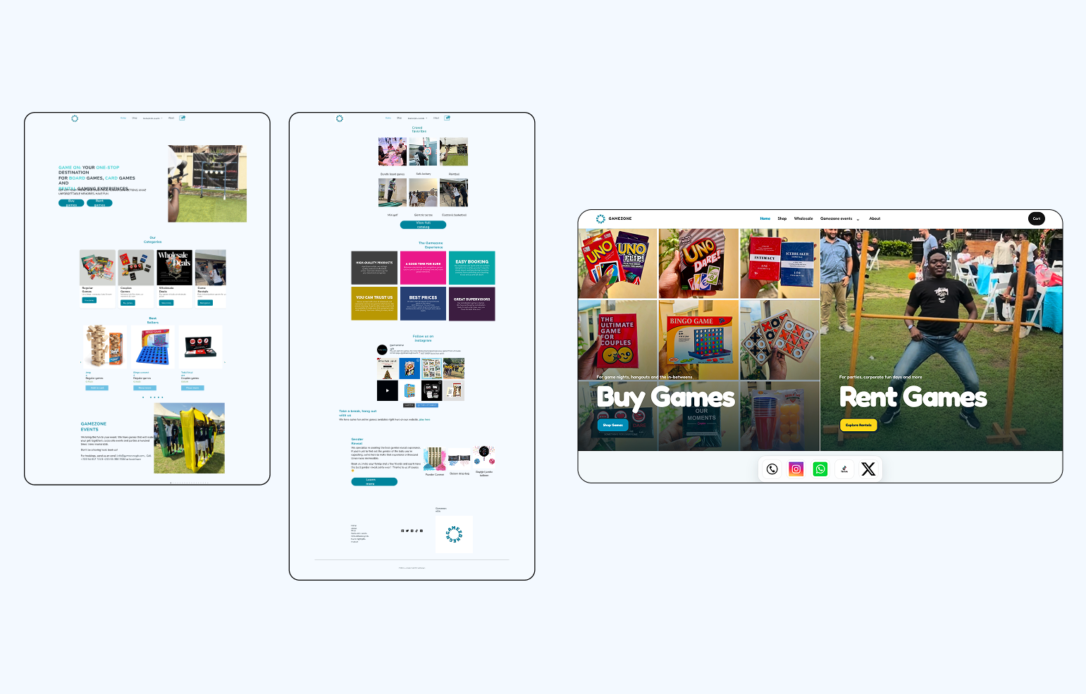
The homepage was redesigned around the two most important choices: Buy Games and Rent Games.
Instead of asking visitors to decode the business through a long general homepage, the split layout lets them recognise their intent immediately. One route leads into the storefront; the other leads into Gamezone’s event and rental experience.
The navigation reinforces the same logic. Shop and Wholesale are direct destinations. Event-related pages are grouped together. Operational pages such as contact, booking information and terms remain available through the journey and footer without overwhelming the primary navigation.
3. Creating a visual system from the brand’s personality
Gamezone is playful, energetic and human. I built the visual system around rounded Fredoka typography, Gamezone blue and yellow, a darker accessible blue for text, strong color blocking, soft corners, and a responsive hierarchy that could move between expressive marketing pages and information-heavy commerce screens.
Shared rules for navigation, cards, buttons, forms, modals, spacing and status messages also meant later typography, contrast and accessibility improvements could be made across the whole site rather than page by page.
4. Re-building the storefront
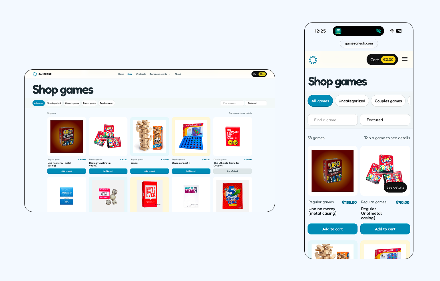
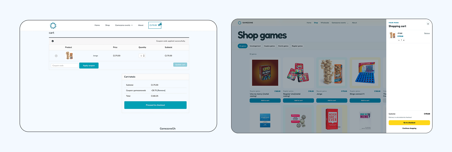
The shop was not a static mockup. It had to work with the products Gamezone already manages. I created a responsive catalogue with category filtering, search, sorting, availability states, live prices, product quick views, full product pages and related recommendations. Filtering happens without repeatedly reloading the page. The quick view keeps customers in context, combining imagery, information and add-to-cart. Instead of full product pages, which was the way it worked, I used modals with the products so that the website won’t have more pages than it needs. Information that could be presented in modals stayed in modals, while pages were reserved for full experiences.
5. Rebuilding the events experience from existing content
The events part of the business required a different product experience. Customers were exploring possibilities for a future event, not adding every activity to a conventional cart.
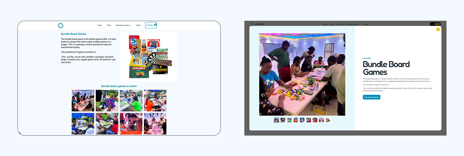
I created a dedicated events landing page, a visual game catalogue, game-detail popups, package comparisons, event pricing, terms and booking, gender-reveal information, and event-highlight galleries.
Again, instead of dozens of individual pages for rental games, I used modals for the same reason as the product descriptions in the shop: so that the website would not have more pages than it needed and the experience would remain consistent across pages.
Creating a consistent footer system
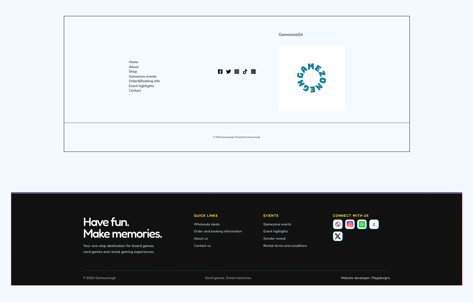
The footer was more than a finishing detail. The old site handled navigation, contact information, policies and booking routes differently across static pages and WordPress-rendered templates. I created one shared footer structure so customers could reliably find ordering information, rental terms, contact options and the correct route back into the shop or events journey from anywhere on the site.
Keeping that structure consistent also reduced maintenance. Route changes and content refinements could be applied across the experience instead of being corrected page by page.
Accessibility and resilience
Accessibility was handled through the shared system rather than added at the end because accessibility should never be an afterthought. The theme includes stronger typography and contrast, a separate accessible blue for text, visible focus rings, a keyboard-accessible skip link, larger hit areas, semantic controls, responsive forms, reduced-motion support, and clear validation and transaction notices.
Technical architecture
- WordPress manages pages and administration.
- E-commerce plugin owns products, prices, stock, cart state, checkout, orders and payments.
- The custom theme provides the design system, templates and interactions.
- Customizer controls give Gamezone ownership of announcement banners and curated social content.
This architecture allowed the website to look bespoke while remaining connected to the tools Gamezone already uses.
Outcome
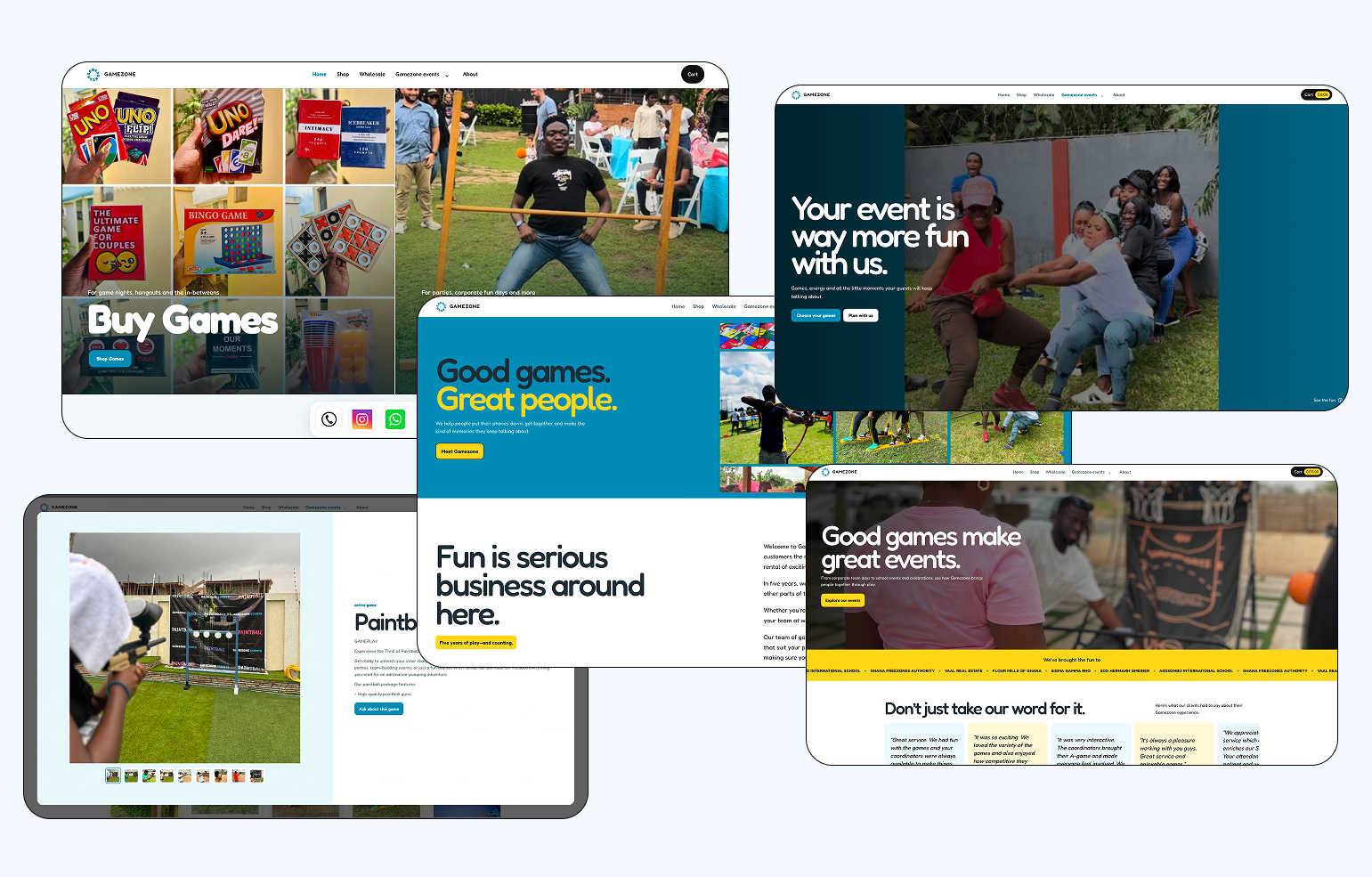
Gamezone now has a website that better reflects the business it has grown into. Shopping, rentals, events and wholesale are brought together in one cohesive experience, while each offering still has its own clear path.
The redesign makes it easier for customers to understand what Gamezone offers, discover games and event experiences, and move from browsing to buying or booking. The more playful visual direction and interactions also bring much more of Gamezone’s personality into the experience.
What this project taught me
Revisiting a website I designed a year earlier showed me how quickly a product can outgrow decisions that once worked for it. This time, I was thinking beyond individual screens and considering how content, navigation, commerce, responsiveness and the systems behind the interface all shape the customer experience. It also reminded me that redesigning an existing product doesn’t always mean starting over. Some of the most important decisions came from knowing what to keep, what to simplify and what needed to evolve with the business.The visible interface was only one layer. The quality of the experience also depended on a lot of other things, even how things worked in the backend. It was beyond the interface design.